Meta: Google Calendar

I finally figured out how to aggregate multiple Google Calendars into a single view. I knew it was possible, because others have done it with my Flatbush Gardener calendar. My calendar has been in the sidebar for some time now, but I have to squish and stretch it so it will fit comfortably. Here’s a big version.


I found the trick to aggregation in the Google Calendar Help Center:

If you’d like to customize your embedded calendar, click the link above the iframe field to access the Google Embeddable Calendar Helper. …
To display events from multiple calendars in the same embedded calendar, simply follow the instructions above to access the Google Embeddable Calendar Helper. Then, check the box next to each calendar you wish to display, listed under “Calendars to Display.”
How do I embed Google Calendar on my website?

The “link” mentioned reads “Customize the color, size, and other options.” “Other options” is a rather obscure reference to “oh, and by the way, you can aggregate multiple calendars.”

Of more importance is the HTML that gets rendered, in particular, the parameters to the URL which is the src of the iframe which renders the calendar. Here’s a partial list of what my calendar widget now contains:

  1. %lt;iframe src=””>
  2. showTitle=0
  3. mode=AGENDA
  4. height=300
  5. wkst=2
  6. bgcolor=#FFFFFF
  7. src=xrisfg@gmail.com
  8. color=#0D7813
  9. …>

And here’s a translation:

  1. “iframe” is the “container” for the calendar. “src” identifies the contents. Here, we’re asking Google Calendar to generate the contents for use, based on the other parameters we provide.
  2. “0” (zero) is programmer for “No” or “Off”. In other words: don’t display the title of the calendar, “Xris (Flatbush Gardener)”.
  3. The default layout for the calendar. On wide displays, tabs at the top of the calendar allow you to choose different layouts. I chose “Agenda” as the default because it shows the most information about each event.
  4. The height, in pixels (dots on your display) for the contents.
  5. “wkst=2” means “Make Monday the start of the week.” Doesn’t make any difference for the Agenda layout.
  6. “bgcolor” = “background color.” “FFFFFF” means “white.”
  7. Which calendar to display (mine, in this case).
  8. With which color to display the preceding identified calendar.
  9. Repeat 7&8 for each calendar you want to aggregate.

Meta: #4 (The Brownstoner Effect)

As of this morning, Flatbush Gardener is, however briefly, #4 in Top 100’s list of gardening sites. As Willy Wonka would say, “That’s just unexpected, and … weird.”

[When I started out writing this post, I was #5. It went up to #4 while I was writing it.]

There are a couple of things going on that contribute to an anomaly like this. Part of the explanation is that I’ve been home sick most of the week. I’ve had time to do research and write for the blog, and I know that fresh content is the biggest draw for visitors to the site. However, the larger factor in this anomaly is what I call the “Brownstoner Effect.”

I use a couple of different tools to measure visits to the site. Here are charts from two of them, Sitemeter and Statcounter, showing page views and visits to the site over the past 30 days.

SiteMeter 30-day Chart for Flatbush Gardener, November 10, 2007

StatCounter 30-day Chart for Flatbush Gardener, November 10, 2007

A couple of things are visible in these two charts:

  • Although their actual counts are different, the shapes of the two charts are roughly the same.
  • There was a spike in visitors and page views from October 23-25.
  • There’s been a sustained higher than usual number of visitors over the past four days, since November 6.

I need to dig just a little deeper to figure out why there’s increased traffic on those dates. It doesn’t take long to determine that those are days that Brownstoner had a link to one of my posts.

My free Sitemeter account only provides details for the last 100 page views. It’s okay for seeing the most recent activity, but nothing beyond that. Also, it doesn’t provide any quick analytical views of the data. But I can’t see the 100 most recent “Referrals”, links from other sites. Right now, for example, 8 of the 20 most recent came from Brownstoner. So the sustained traffic of the past few days seems to be continuing.

My upgraded StatCounter account records the last 2,000 page views. More important, it provides some basic analysis of the data.

Referring Link
drill down 376 www.google.com
drill down 252 No referring link
drill down 192 images.google.com
drill down 191 www.brownstoner.com
drill down 68 www.blogger.com
drill down 65 brownstoner.com
drill down 46 www.livinginvictorianflatbush.com
drill down 43 ditmaspark.blogspot.com
drill down 25 kensingtonbrooklyn.blogspot.com
drill down 24 search.yahoo.com
drill down 15 images.google.co.uk
drill down 15 www.flickr.com
drill down 13 brooklynjunction.blogspot.com
drill down 11 aolsearch.aol.com
drill down 8 www.kensingtonbrooklyn.blogspot.com
drill down 7 del.icio.us
drill down 7 images.google.ca
drill down 7 search.aol.com
drill down 7 www.google.ca
drill down 6 images.google.com.au

As usual, Google tops the list with 376 of the last 2,000 views. Most of the visits to my blog come from Google searches. I periodically look at what people are looking for when they find my blog. That helps me categorize my content better, and sometimes leads me to improve specific posts. But that’s a topic for another post.

In second place, with 256 views when you combine the results for “www.brownstoner.com” and “brownstoner.com”, is Brownstoner. You can also see several other familiar (to Brooklyn readers) blogs: Living in Victorian Flatbush, Ditmas Park Blog, Kensington (Brooklyn) (with 2 URLs), and Brooklyn Junction. They’re all neighbors who write about local topics.

Next is “No referring link.” In theory, this should reflect all views where folks visited my blog directly, without getting referred by a link from another page. In practice, this also includes anyone who is blocking referrer information, or who has cookies disabled, perhaps specifically for StatCounter.

There are always some sources of error in numbers. Identifying and removing them is important to me. For that I prefer the power tool of “hit counters” Google Analytics.

Update: By the evening, Flatbush Gardener was .
#3 Top 100 Gardening Sites

Meta: Blogger/Blogspot now provides comment feeds

I haven’t had a chance to try this out yet, but Blogger Buzz announced today that you – yes, you – can receive follow-up comments by email. You can subscribe to a post’s comments by clicking the “Email” link next to “Subscribe to comments” on the post page.

There’s a bit of a catch to it, though:

In order to receive follow-ups via email, you’ll need to post your comment using your Google Account. We only send comments to your verified Google Account so that someone else can’t use this feature to send you email you didn’t sign up for.

Not much worse than I’ve experienced on some other hosting services, especially TypePad. So, not ideal, but better than nothing.

Links:
Subscribe to Comments – by email! (Blogger Buzz)
How can I subscribe to comments by email? (Blogger Help)

Bling: Minicards

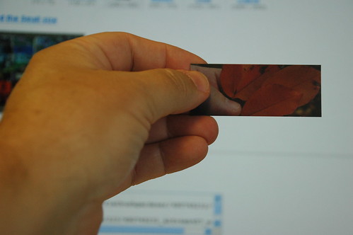
My left hand holding a Moo Minicard with a photo of my left hand holding a cluster of fallen leaves on Rugby Road.
Moo Minicard

I’ll be handing these little beauties out at tonight’s Brooklyn Blogfest. Each is printed with a crop of one of my Flickr photos on the obverse. The reverse has my name, blog and Flickr site addresses, and the date, time and title of the photo.

Disclosure: When I first tried to order these through the Moo site, there was a problem with the order. They apologized, attributing the problem to something to do with Flickr’s API. They gave me a coupon code for a free set of cards. Normally, they cost $25 (USD) including shipping/postage for 100 cards, or 25 cents per card.

Flickr has a link to Moo on their home page. This takes you right to the following steps to create the minicards.

Step 1: Choose photos from Flickr

Moo MiniCards Choose

For the past few months, I’ve been collecting sets of my photos by color. The Moo photo chooser lets you filter your Flickr photostream by set. This made it easy to select the best images for each color, and drag and drop them into the selection area.

There are 100 minicards in each set. The photos you select are are duplicated as needed to fill out 100 cards. I chose 50 images, so I got exactly 2 cards for each photo.

Step 2: Crop photos to fit the mini-card form factor

Moo MiniCards Crop

Here you select the crop for each image. You can set the crop vertically or horizontally, and drag it up and down or left-to-right to frame it best for the card.

In retrospect, the horizontal images work out best on the card. It’s more natural to hold the card horizontally, as I do in the photo at the top of the page, than vertically. This might influence my choices for images if I were to do this again.

Step 3: Personalize to include information about yourself and/or your photos

Moo MiniCards Personalize

I figured I’d be able to personalize the cards with my name and contact info. What I didn’t expect was that I could include information about each photo on the reverse of each card. I chose to include the date and time the photo was taken, as well as the Flickr title of each photo.

Again, in retrospect, I should have made sure that each photo had a text title, instead of the default filename from the camera. The other thing I would change would be to drop the profile photo. It’s too small to be of much use, and it take sup too much room which could be used for longer lines of text.

I also forgot to include my email address in my info! That’s something I would correct the next time I do this.

The result

Moo Minicards Sampler

This shows 40 of the different images I selected. I selected 50 images altogether, 2 cards for each image. You can really see the rainbow effect here, as I intended.

Everyone to whom I’ve given a card has remarked on the quality and feel of the card-stock. They just feel good in the hand. They’re the same thickness as a business card, but they feel stiffer, both because they are smaller than business cards – about 40% of the area – and because the cards have a matte, plasticy-feeling finish to them.

I also spent some time playing around with the cards, arranging them in different combinations, to see how a rainbow photo banner might work. It could be very effective. I’ll need to select horizontal crops of my images which could work, and also work out what dimensions the banner should be. I’ll also need to play around with different fading or transparency, so that the blog title and other info will be readable against the background photos.

Yet another future project.

I couldn’t resist

What classic actress am I?

Katherine Hepburn.

I couldn’t be more pleased.

What Classic Actress Are You?


Katharine Hepburn.She is an icon but beyond that, she was one of the most highly respected and talented actresses in film history.

Unconventional, Independant, Intelligent, Feisty

You are never afraid to speak your mind and make no attempt to conform to other other people’s demands or social norms. You might be seen as haughty and demanding at times but you just want to make sure you do your best on your own terms. Whenever your capabilities are questioned, you end up proving your critics wrong. You have the brains and the brawn to be the alpha-female in a man’s world, always holding your own. Go, you!
Take this quiz!


Quizilla |
Join

| Make A Quiz | More Quizzes | Grab Code

via Blue Gal.

Geeks Rule! Victory Over Bling …

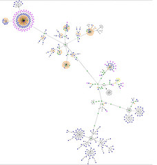
Finally! I figured out how to capture the image from Sala’s HTML Graph Applet, which I wrote about earlier this week.
My Blog, FlatbushGardener, visualized as a graph, October 26, 2006
This is a snapshot of this blog taken earlier this evening.

This will work on any Windows system. Here’s how I did it:

  1. Ran the HTML Graph Applet against my blog until the knots straightened themselves out and all the dots settled down.
  2. Resized the browser window so the entire graph was visible and took up as much of the browser window as possible.
  3. Pressed [Alt]+[PrntScrn]. This copies the active window (the browser window) to the clipboard.
  4. Opened Windows Paint and selected Edit > Paste. (Any image-editing program which allows you to paste from the clipboard and crop the image will work.)
  5. Cropped the image and saved it. (This is not the easiest thing to do with Paint, but it’s possible.)

That’s it! Give it a shot on your blog or favorite Web site and let me know how it works for you.

Geek Bling: HTML Visualizer

Update 2006.10.26 22:50 EDT: Just figured out how to capture the graph.


This is just one of those cool, nearly useless toys on the Web. The graphs it constructs are interesting in themselves, even somewhat informative, once you get used to reading them. It’s fairly deterministic; if the Web page content is the same, you’ll get the same graph. You can see lots of examples on Flickr.

I’ve done this a couple of times against my blog’s home page, and it really does change as my blog’s contents change. With a little work, you can figure out where the different structures come from. A blog entry with lots of photos is an outer ring of purple dots for the images with an inner ring of blue dots for the links. It looks like a dandelion head gone to seed.

But the really fun part is watching the graph get constructed. It looks alive – like a plant emerging, leaves coming out and unfurling, flowers blooming – as the applet parses the HTML elements. Then it slowly … heals itself. It re-arranges its nodes to correct crossed lines, evenly disperse the nodes and “flowers” on the branches.

You can view the Flatbush Gardener graph. Since it’s a Java applet, it requires Java to be enabled in your browser. It won’t work from behind most corporate firewalls, I would bet. A high-powered graphics system is also strongly recommended!