[Updated 2006.09.05 10:39 EDT: Reduced image sizes to fit displays with 1024×768 resolution.]
[Updated 2006.08.22 16:10 EDT: Added examples for each “consideration.”]
Susan Harris just posted Tenets of Garden Photography over on Garden Rant, in which she asks some provocative (to me) questions:
… let’s see how they [tips on improving vacation pictures] translate to our world.
The first advice is to not cut off people’s feet, which makes me wonder: is there a plant part that, if cut off, spoils the photo? And the admonition to avoid telephone poles coming out of your subject applies equally well to plant subjects as to human. But really, there’s lots more useful stuff here, like the fact that we usually see the subject, not the whole frame, and we should always “check the borders.” And my favorite – a discussion of qualities of light that goes beyond the avoid-harsh-sun advice we see everywhere to describe “sweet light” and suggest that flash be only during the day, never at night. I just love that counterintuitive stuff!!
Specific to travel, photographers are reminded to catch these elements: people, scenics, details, food, movement, action, and nightlife. So what do you suppose the must-shoot elements would be in gardening photography? Maybe entrances, whole borders, close-ups, small plant combinations, animals, and such hardscape as seating, stone, wood, and statuary. What else?
I started leaving a comment there, but after my comment started getting longer than her blog entry, I thought I should write my own in response!
I’ve been “a photographer” since before the age of five, almost more decades than you can count on the fingers of one hand. The way I’ve photographed, and how I share my photography, has changed a lot over my lifetime. It continues to evolve, not only in response to the huge technological changes, but also to changes in me and my life and interests.
I don’t remember the last time I used a “real” (film) camera. The time lag for feedback between what I thought I shot and what I got made me try to make every shot count. Without access to a darkroom, or the skills to take advantage of it, I learned to compose my shots “in camera”: to carefully frame each shot in the viewfinder to get exactly the picture I wanted to eventually see.
Starting about 1980, I shot slide film exclusively. I “edited” each roll I got back, going through every slide, and selecting the ones which were not only technically perfect (focus, exposure, and so on) but which also captured what I was striving for when I took the picture. At most, I would get two or three “good” shots out of the roll; maybe 1-5% of all the photos I took. These are the only ones which anyone else would ever see. From this population I selected maybe 10% as “candidates” for printing. Again, maybe only 10% of these ever made it to paper. So most folks only saw a tiny percentage, less than 1/1000, of all the shots I took. And yes, I shot thousands of images each year.
Digital photography, blogging, and social networking sites such as flickr are allowing me to share my photography in ways it would have been far too expensive or cumbersome to do in the past. I can experiment more wildly, since I can get immediate feedback on the success of the shot, and the cost of making mistakes is only the time it took me to setup and take the shot. (And delete the mistakes!)
But I’ve kept my old habits. I still compose in camera, and take the time to setup each shot, even though I could easily crop the image on my computer. I don’t dump every photo I take into public view; I still edit the collections. I still go through each image, deleting the ones which are out of focus, or shaky, or under- or over-exposed. Some of these could be corrected digitally, but, unless I have only one image of something, it’s not worth it. There are other, better, shots in which I got what I wanted.
And some things are unchanged by the technology. The qualities of light, dimensions of composition, and the sensuality of beauty and nature are, in deep ways, eternal. It’s my challenge to capture those eternal qualities in a frozen image.
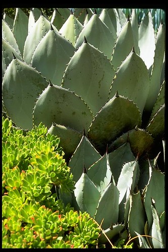
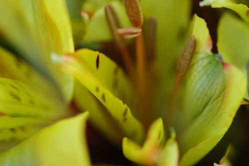
I’ve got two basic reasons for my garden photography: beauty and documentation. While they’re not mutually exclusive, my goal for any shot is primarily one or the other. Good examples of both, and examples of all of the following considerations, can be found in my recent series of photos of “Baby” at the Brooklyn Botanic Garden, as well as the other photographs in this blog.
Some of the things I consider in my photography are:
Balance

This doesn’t mean that the top and bottom, or left and right sides, are mirror images of each other. Balanced asymmetry is much more interesting. Think of a larger and smaller person on a seesaw, and how they move along the beam to balance each others weights. A classic photographic example is the horizon line; it looks best above or below the center-line of the image, depending on where the interest lies. In garden photography, to achieve this I either let the primary subject fall to one side or the other, or let the line of the subject follow a diagonal across the frame.
Scale

Related to balance, but especially important for documentation photography, is providing a sense of scale in the image. This usually involves including some familiar artifact, such as a chair, path, building, or other “hardscape” element in the image. People are also good for providing scale!

On the beauty side, some of my best photography plays with and disguises or distorts the sense of scale. Macro-photography is one of my favorites for this. Seeing things close-up, the views we usually never stop to see, allows us to see things in a new way, to see details we would never notice. There is so much beauty in the world which we miss because it is too big or small (or we are too small or big) to see it all at once.
Color

Of utmost importance for me, which is why I shot slide film. Related to this, the best color is achieved by slightly under-exposing the image, by 1/3 or 1/2 stop. This leaves the colors more “saturated” and less washed out, making the image more vivid and natural looking. Subtleties of color and variation in color are themselves often subjects of my photography.
Light

My favorite photographs are able to capture the quality of light which was present when I took the photo. This is a big challenge, but awareness of light – its color, its direction, its qualities – is important to consider when taking the shot. Overcast days are the best for garden photography. With reduced contrast between light and dark, not only can colors be more saturated, but texture and structure don’t get lost in the shadows or washed out in sun.
Think of light streaming through the leaves and trunks of trees, or the crepuscular rays of sunlight between clouds. Light becomes visible in these ways when it’s scattered by moisture or particles in the air. In other words, the light is making the space visible, giving a three-dimensional quality to the image, and providing the viewer with a palpable sense of the place in which the photo was taken.
Time

Everything is changing all the time. In the garden, some of these changes are obvious, but mostly they are visible only over time. Capturing the different stages of growth of plants and their parts is, again, a way of helping us see the things we would otherwise overlook.
The fronds of a fern just emerging from the ground are incredibly detailed, but we rarely see or observe them then. A bud before it opens, or the dried husks of plants in winter, these are things which are also part of the garden, and also beautiful. They are reminders of how fleeting it all is. How temporary and ephemeral is each moment in the garden, as are we.


