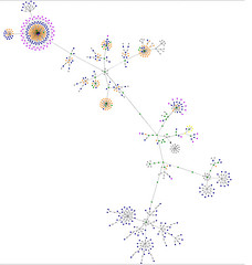
I’ve just implemented expandable post summaries on this blog and the last several posts appearing on the home page. The first section of each post appears on both the home page and the item page, as this paragraph does. The rest of the post is displayed only when you view the item page, which you can reach by following the “Continue reading …” link at the end of the post’s summary content on the main page, or the usual Date/Time “perma-link” below the content of each post.
My motivation is to try to reduce the percentage of folks who leave immediately upon arriving at the home page.
Combining information from the three visit trackers I’m using – SiteMeter, StatCounter, and Google Analytics – I know that most folks arrive here through the home page, which make sense. But the trackers also show me that it’s the only page they visit, and they often leave immediately upon arriving. Google Analytics calls this the “bounce rate”; the other trackers call this “visit length” or “visit depth”. Here’s how Google Analytics explains it:
Entrance Bounce Rates: Do visitors continue their visit after viewing their first page or do they immediately leave my site? This report lists the top entrance pages on which visitors land and their respective number of Bounces and Bounce Rates.
It’s a highly volatile value. For example, the bounce rate for the home page has varied from a low of 32% – damn good – to a high of 88% – pretty poor. It seems to average between 65-70% week-by-week. I want to see if I can get it down to, and keep it under, an average of 65%. At the same time, I’d like to see if I can increase the visit length and/or depth, which I take as a measure of the value folks find in what I’m posting.
I’ve come up with three hypotheses:
- It’s not what they were looking for.
- They only read the latest content, which is available in its entirety on home page of the blog.
- The home page is bloated and overloaded and slow to load, and they don’t want to wait.
It’s the last case I’m trying to address. Although my sidebar could use some trimming down, and I’ve got several counters in the footer, most of the size of the page comes from the content. This makes the home page slow to load, and forces lots of scrolling to see all the recent posts. This is especially true for posts that have lots of images, like the recent post about the Sheep & Wool Festival. By trimming down the content displayed on the home page, that page will load faster. It will also allow visitors to see the summaries of each post without having to scroll more than two or three screens, an important web usability design principle.
A side effect occurs for the second case. The various visit trackers can only count when visitors click from page to page within my blog. So when regular readers read all the content of recent posts from the home page, the trackers don’t know that they’re “staying” on the blog, and record it as a short, single-page, “bounce”. In other words, the trackers record this as a “false negative”. With the click-throughs from the summary to the full post, the statistics will more accurately reflect how people are using the blog. For you, my regular readers, to click through to the item page, doesn’t seem too onerous. Please let me know whether or not that’s the case!
It’s also possible that this could influence the first case. Most of the references to my blog come through Google, and people searching for all kinds of things come to this blog. But it’s not for everyone, and that’s okay. There’s a possibility, however, that some folks arriving here might find something of value, but don’t discover it because they don’t see enough of the recent posts, or the poor performance of the page interferes with their ability to assess its content. Either way, improving the performance of the home page would make it more likely that those folks could discover there’s something here for them, and stick around to read some more.

